The Dark Kitchen Is Having a Moment—for Good Reason
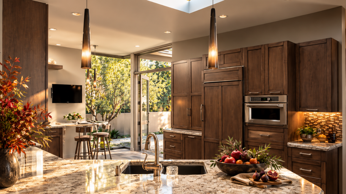
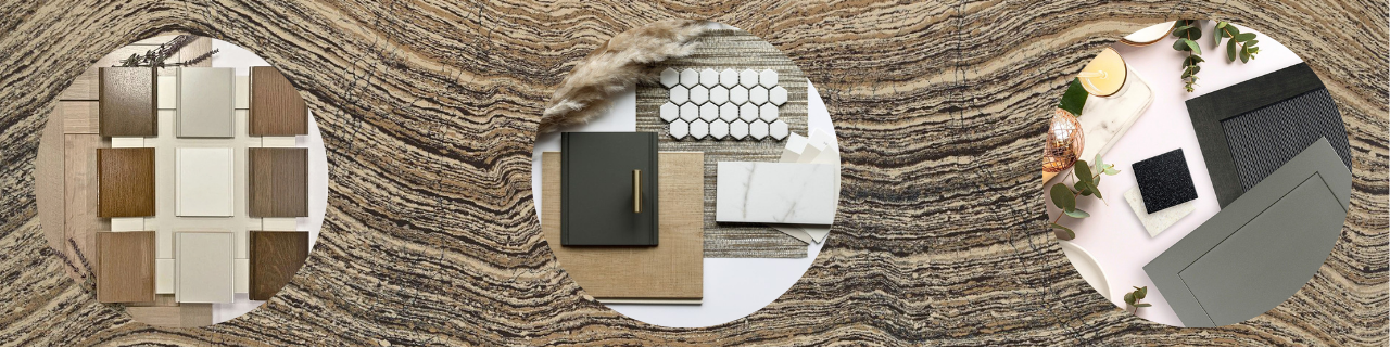
For years, white kitchens dominated residential design. White cabinetry. White stone. White backsplash. Bright overhead lighting. Then something shifted. Deep walnut returned. Black and charcoal cabinetry appeared. Saturated greens, smoky blues, dramatic stones, and richly textured surfaces began finding their way back into luxury kitchens.
Part of their appeal may be precisely what we've been exploring throughout this series:
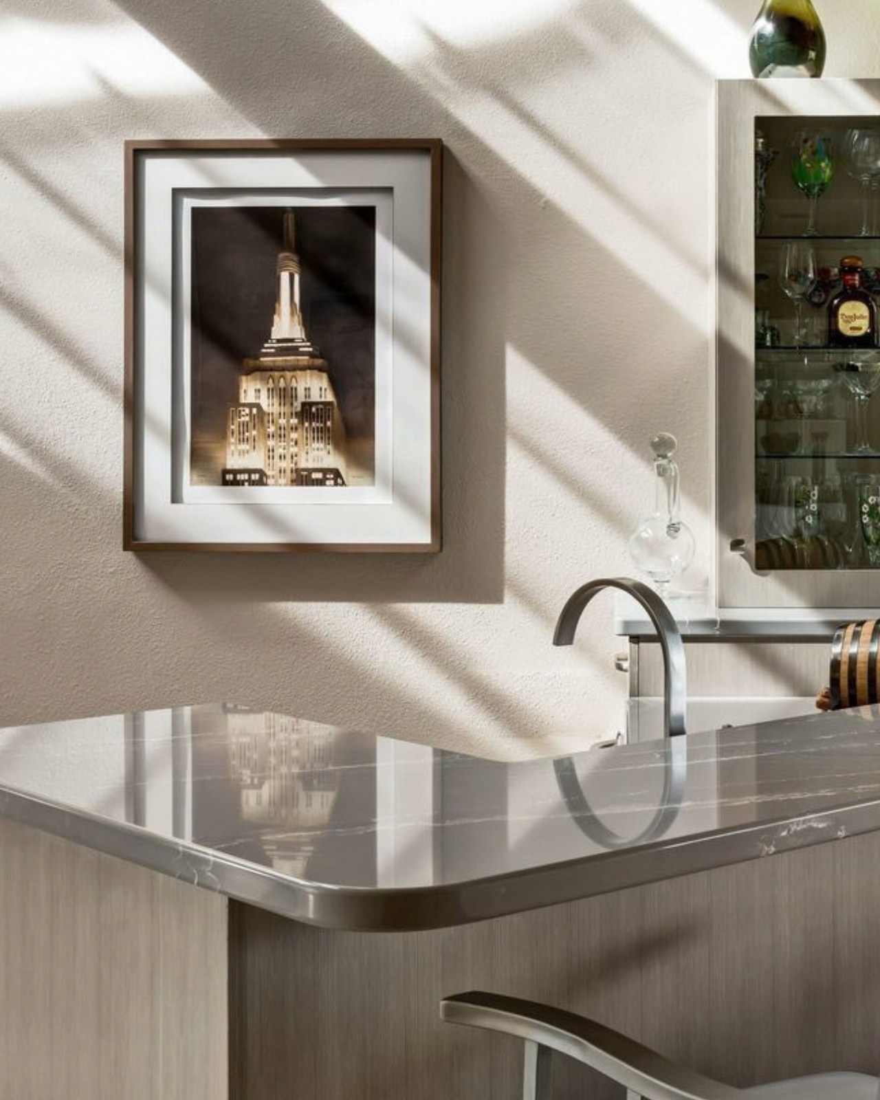
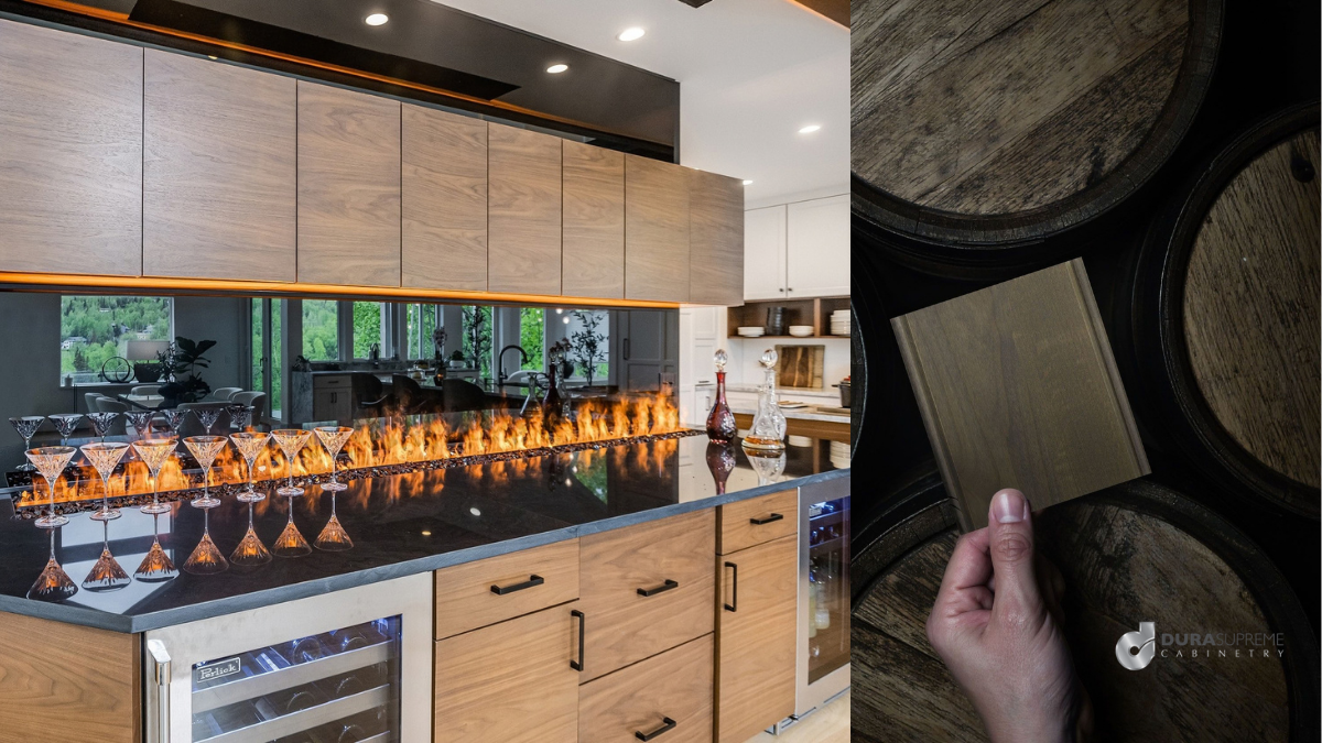
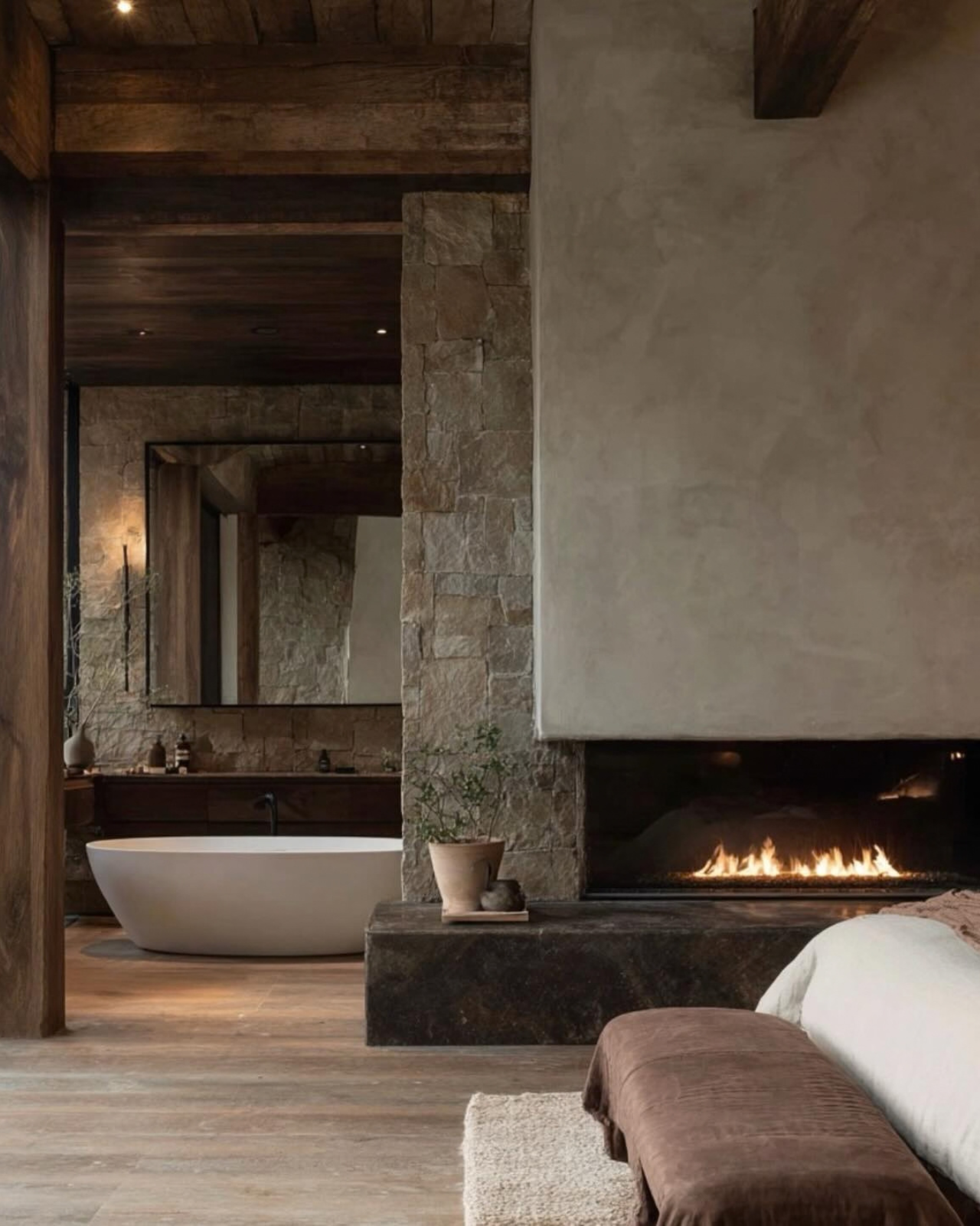
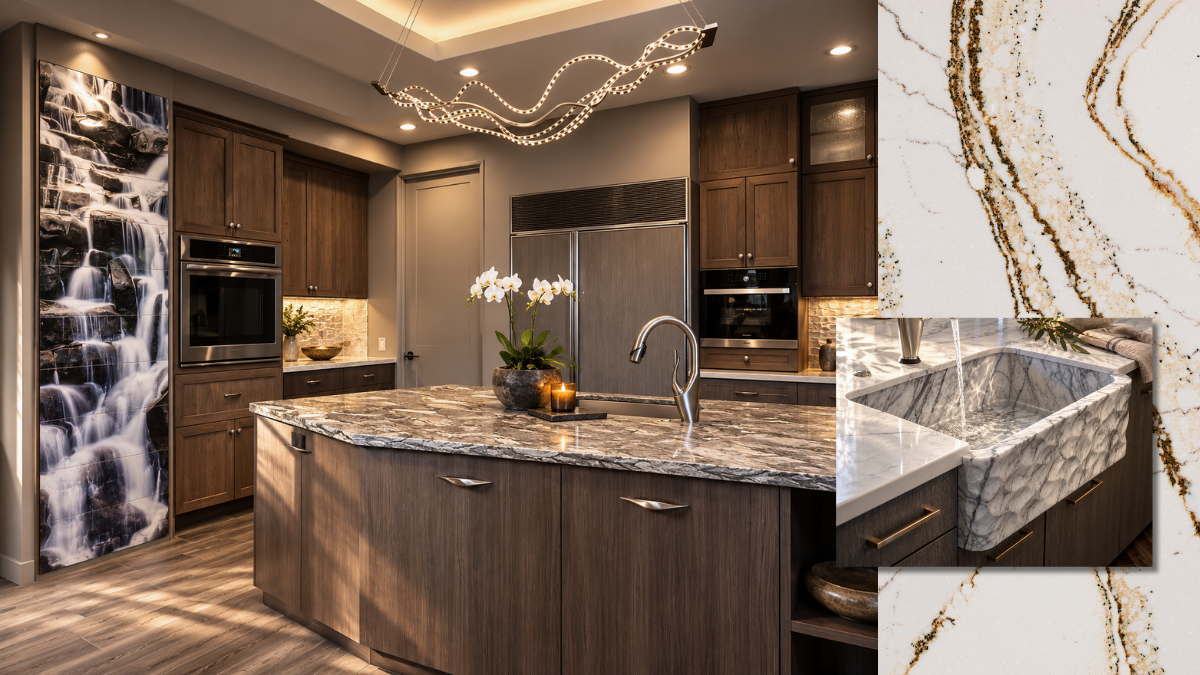
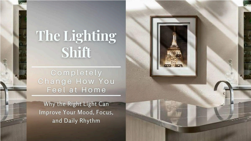
our experience of a room depends on contrast. Dark cabinetry changes the way we perceive everything beside it. A pale countertop appears brighter. Metallic hardware catches the eye. Food becomes more colorful. Natural wood feels warmer.
Daylight becomes something we actually notice rather than simply something filling the room. And this is where Lynn's fine-art background becomes especially valuable. An artist doesn't use darkness because she has run out of light.
She uses darkness to reveal what the light is doing.
Designing with Shadow
This may be one of the most misunderstood elements of luxury interiors. We spend enormous amounts of time designing lighting—and remarkably little discussing
shadow. Yet one cannot exist without the other. When every surface receives the same amount of illumination, depth begins to disappear. Texture becomes less noticeable. Materials flatten. The eye has fewer cues telling it where to linger.
Dramatic Stone: Nature's Artwork
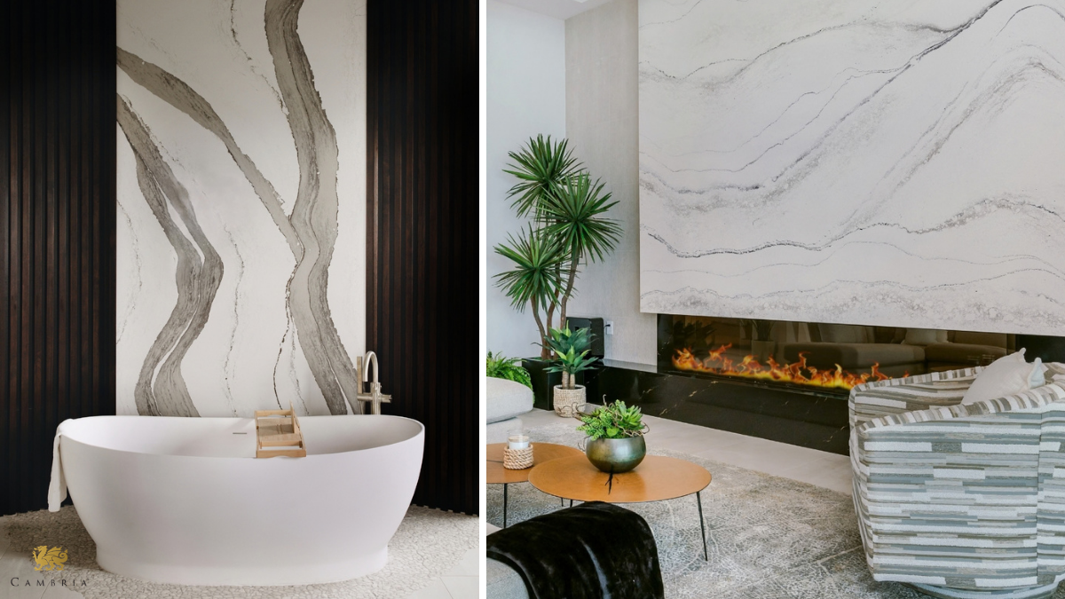
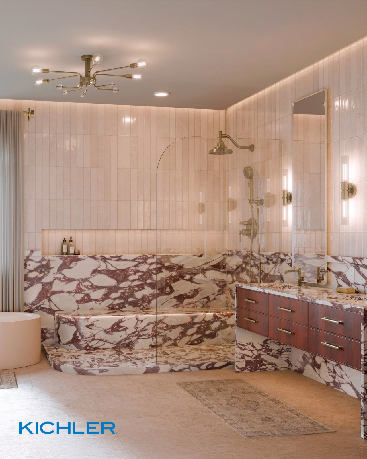
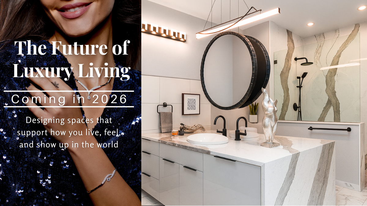
If Risk/Peril is about visual tension, few materials accomplish it as beautifully as stone. Consider the difference between a surface with quiet, uniform movement and a slab crossed by bold veining. Our eyes follow those lines. They climb. Divide. Disappear. Reappear.
A dramatic stone backsplash can almost behave like a landscape—something we visually explore rather than simply register. And nature rarely worries about whether every pattern matches. Rock fractures. Mineral deposits create unexpected color. Rivers carve irregular paths. Trees twist toward available light.
The visual excitement comes partly from
variation within an underlying order.
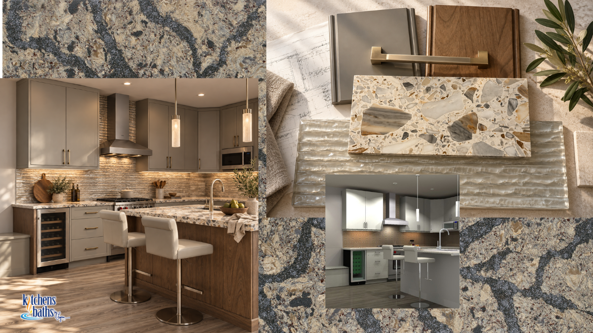
For Lynn, whose designs often layer pattern and texture in ways that can be difficult to fully capture in photographs, this is familiar territory. Her fine-art sensibility allows stone, tile, cabinetry, metal, light, and negative space to operate not as isolated selections, but as a composition.
The question isn't simply: Does this stone match the cabinetry? It becomes:
What happens when these materials meet?
Risk Without Recklessness
There is an important distinction here, particularly in kitchens and bathrooms.
Risk/Peril is an experience—not an excuse to create actual hazards.
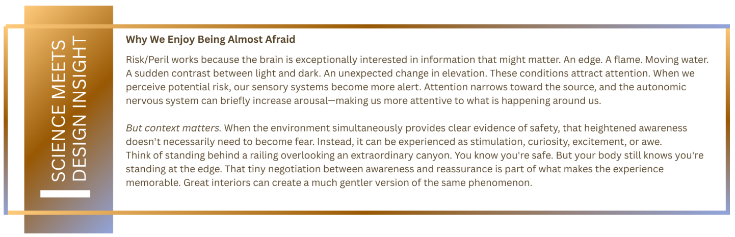
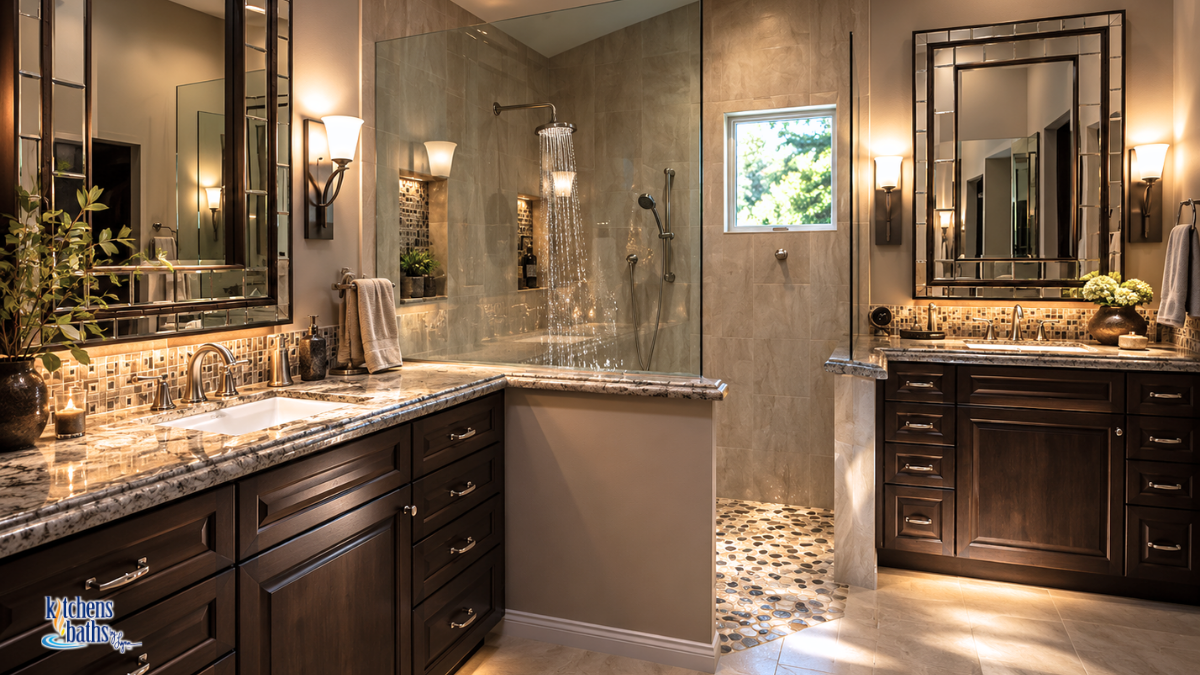
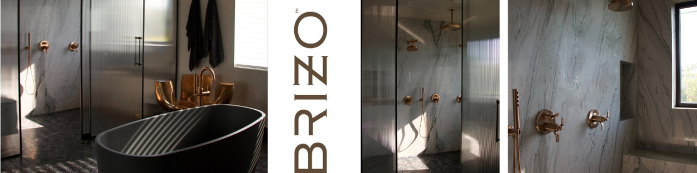
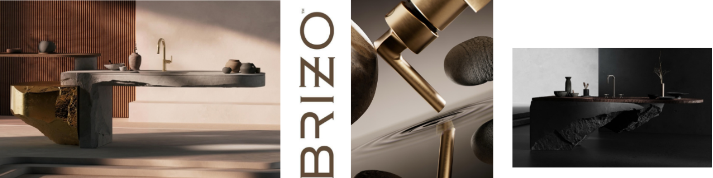
A dramatic cantilever still needs appropriate engineering. A fireplace requires proper clearances. Wet surfaces require suitable materials and slip resistance. Showers need thoughtful drainage. Lighting around water must comply with applicable electrical requirements. Glass, railings, countertop projections, and circulation paths all need to perform safely. In fact, the principle becomes more successful when the safeguard is trustworthy.
The homeowner shouldn't actually wonder whether something is dangerous. The architecture should handle safety so confidently that we're free to enjoy the sensation.
Luxury is not danger. Luxury is being able to experience drama without sacrificing security.
Contrast Makes Beauty Legible
There is another reason October's pattern belongs in this year's conversation. Contrast helps us perceive. We understand rough because we know smooth. Warmth becomes more noticeable after cold. Quiet feels different after noise. Light becomes visible because shadow exists beside it.
This is true aesthetically—but it also gives us an interesting way to think about gratitude. We often imagine gratitude as an instruction to focus exclusively on what is pleasant. But the human experience doesn't really work that way.
Sometimes appreciation becomes possible
because we have experienced contrast. The first warm shower after being caught in the rain. Walking into a softly illuminated kitchen after arriving home in darkness. The warmth of a mug between your hands on a cold morning. A familiar light left on for you when you return home late. None of those experiences requires us to celebrate discomfort. The contrast simply makes the comfort easier to recognize.
And that is just how subtle risk and peril can be and still be able to experience their powerful presence.
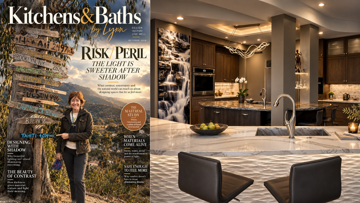
The Light Is Sweeter After Shadow
Perhaps that is Risk/Peril's most beautiful lesson.
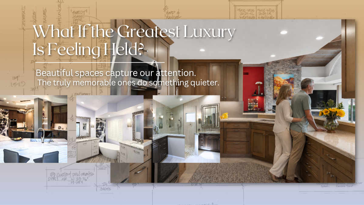
A meaningful home does not need to eliminate every shadow, flatten every contrast, or make every experience visually quiet. It can contain drama. Mystery. Depth. Movement. Moments that sharpen our attention and remind us that we are fully present. Because sometimes the role of good design isn't to make us feel less.
It is to create an environment safe enough that we can
feel more.
At Kitchens & Baths By Lynn, that might mean the glow of warm lighting against dark cabinetry. A spectacular vein of stone cutting through an otherwise quiet palette. Fire reflected in water. Or a room that allows part of itself to disappear gently into shadow.
These contrasts don't diminish comfort.
They reveal it. And perhaps that is why October understands something the rest of the year sometimes forgets:
Light is sweetest when we've also known the shadow.